I’ve been messing around with WordPress for most of my career and I’ve been through it all. Whether it be a free theme that had 5 forced encrypted sponsored links in the footer or a really great looking theme filled with horrible code, I’ve dealt with it all in my projects.
In my first WordPress blog post for the site helping you choose the right web host, I’d like to focus on the new love of my life, StudioPress Genesis and their child themes. You see, going through the many pains of switching theme after theme … after theme, I decided about a year ago to see what was available in the premium WordPress theme world. I grew tired of dealing with junk themes with bad code, exploits, forced junk sponsored links, and overall terrible quality and stumbled upon Genesis.
I’ve designed a few sites for clients and used the StudioPress Genesis framework exclusively and they all were very impressed with the quality of work I delivered. Thing is, without StudioPress, the job would have been much harder to accomplish. Genesis really makes things easier with their many child themes, with some themes geared specifically to niche markets.
Scott’s Top StudioPress Themes for 2013
This listing is based on top styles for genres and not a “top 10” style list because when I’m looking for themes, I’m looking for themes specific to my needs.
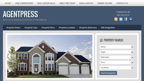
Top Genesis Real Estate Child Theme
I’ve done a real estate blog for a client that turned out extremely well and I loved using this theme. This theme is great for real estate agents to broadcast their premium listings using the custom post types feature within WordPress.
If you’d like to go the lazy approach, you can use this theme effectively to display all listings specific to the real estate agent’s coverage area using a licensed IDX plugin from various IDX providers including DSIdxPress from Diverse Solutions, IDX Broker, FlexMLS IDX, and many others.
Whether you go manual and list your agent’s listings directly within WordPress or using an IDX solution (which can be very costly), AgentPress really gets the job done and does it extremely well.
The only downside to this theme is it isn’t mobile responsive. Therefore, the sites generated with this theme don’t look the greatest on mobile due to the forced full-width display.
See AgentPress in action. Click here.
Top General Purpose Genesis Child Theme
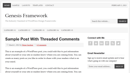
Yikes, even looking at my screenshot, I can feel everyone asking why? Don’t let looks fool you, Prose is actually one of the better Genesis child themes available because it allows you to fully customize the look and feel, including alignment, colors, font sizes, typefaces and other critical design elements within the theme customization options. This is truly the best Genesis theme for beginners! Don’t take my word for it though, see how Prose works with this awesome screencast done by Amy Lynn Andrews:
See Prose in Action. Click here.
Top News Style Genesis Child Theme
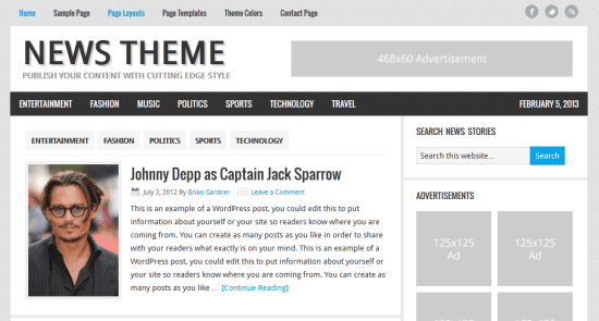
News Child Theme by StudioPress
If this theme looks familiar, it is because it is the base theme for my current site here. I love this theme because it is mobile responsive, lays out content beautifully, and allowed me to do the things I wanted to do easily without having to import code from other themes. As you can see from looking at my site, all themes on StudioPress are highly customizable and you are free to make your own modifications to your liking. The News theme uses a lot of features I choose not to use on my site like the eNews widget shown in the screenshot above.
The News theme is totally mobile responsive. If you want to see what that means, you are already on a site that uses the theme, all you need to do is narrow your browser window and see what happens with the content. I’ve added my own responsive elements and fixed a responsive issue I had with the main page that came with the theme. What I did is change the way responsive works with the “Featured” section so that the second column doesn’t automatically drop out until it is truly needed. This is why I love these themes so much, you can make them do whatever you want if you know a little CSS!
If you have a lot of content to display, be sure to check out the News theme from StudioPress!
Top Photography Genesis Child Theme
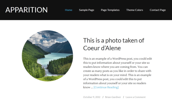
If you are a photographer, I really loved this photography-based Apparition Child Theme the best because it really places your photos up front and center. Apparition automatically adds that nice circle effect to your photos but you can easily change and remove that effect if you want standard rectangular photos to be displayed.
Check out the Apparition theme demo here. Resize your browser width to see responsive effects.
Top Magazine Genesis Child Theme
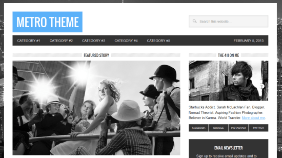
The StudioPress Metro Theme was recently released on January 29th, 2013 and I really like what they’ve done with this theme. Some of the benefits include:
- Mobile responsive
- Super wide 1152px width
- 6 layout options
- 5 color styles
- 3 story locations
This is the widest child theme StudioPress has done and man do I love it. The style of responsive done is really remarkable because if your browser isn’t fully wide enough to show the full 1152px width, the images and content simply resize to allow for the smaller width, yet, if you take the browser inward to the point of a mobile screen, the sidebar still drops out giving you the best of both worlds.
Had this design been available when I was working on this site, I’d likely use it as my base because of the extra real estate it provides your content. It’d allow bigger videos, bigger photos, and so much more.
Update on April 25th, 2013: Since writing this post, I did launch a full redesign of the site with this being how it looked before. True to my word, I used the Metro theme as the base because of the wider layout it offers. I basically stripped out a lot of the code I didn’t want (like the background and header section) and made the theme my own iteration and love what I’ve done.
Be sure to check out the new Metro theme. Resize your browser to see the effects I spoke about above.
Top Mommy Blog Child Theme
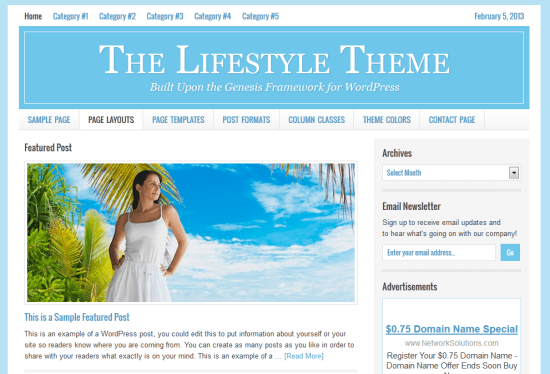
I asked my wife what she thought about the child themes for a blog she was considering running, and she choose the Lifestyle theme for the soft colors and general style. The downside to this theme is it does not include mobile-responsive features yet. StudioPress spent most of the 2012 year relaunching many of the popular themes with mobile-responsive features so there’s hope this theme will see an upgrade this year.
See the Lifestyle theme in action. Click here.
Top Corporate Genesis Child Theme
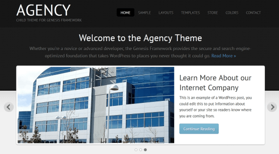
This is one of several corporately geared child themes available. I like this theme for the slider presentation with the black and white colors behind it. It really makes the slider pop out at you and forces the website viewer to read what you’ve included there.
Agency includes 4 color styles, 6 layout options, custom background, custom header, custom menus, featured images, mobile responsive, and WooCommerce integration. See the Agency theme for yourself.
Option for Designers and Developers
All of the above child themes were developed directly by StudioPress and part of what they call the Pro Plus Package. This package currently runs $349.95 and includes all of the themes I’ve featured here plus all of the many other themes that StudioPress designed but does not include those designed by the community. If you have an interest in this package, click here and see all of the themes which currently includes 44 themes in the package, a $1,200 value.
What’s your favorite Genesis theme and why? Leave a comment below and share your thoughts!

Great comparison, Scott. I currently run a website on the Genesis framework already, but am looking at finally converting my main website from a free wordpress theme to a premium theme (this is seriously overdue!).
As it’s a magazine style website, I’m undecided as to whether to go for Metro which looks like it’s pretty much what I need ‘out the box’ or Prose as the enhanced customisation will mean I can make the website look more unique–than with Metro–and would, presumably, make changing the look going forward easier – should I decided for whatever reason that I’d like a redesign. Still, having said that I’m swaying towards Metro because easy, timeless setup goes a long way with me, particularly when I have so many other things to juggle right now.
I’d be keen to hear any thoughts on the Prose VS Metro debate.
Cheers,
Michael.
Michael,
If this is for the site you’ve linked in comment, I’ve got to learn towards Metro. You’ve already got a background image you are using behind your posts and I’d think it’d look great. I recommend Prose to those that want absolutely NOTHING to do with manual modification of CSS files, but honestly, it isn’t that hard.
If you use Firefox, check out Firebug which allows you to make modifications to CSS live on site to see how it’d look, then if it looks great, apply the same changes to the CSS file (Firebug even gives you the CSS line number).
I’ll be doing training videos on the entire process once I finish my “First Website” training series I’m working on (First video uploaded yesterday http://www.webhostingchoose.com/first-website/getting-a-domain-first-website-beginner-video-training-series/ ).
Hi Scott,
That’s the website. I’m buying Metro today. I was going to use a Theme Test plugin to work on the site and then send it live straight away, but just in case that goes wrong I’ve decided to use a test site first. It seems the safest way to go about it. I’ll let you know how it goes but hopefully I’ll have the new site live in the next month.
I’ll certainly give your new website series a look; sounds like a great idea. I know the most basic of CSS but as a website owner should probably invest in learning a little more going forward.
Thanks again!
Michael.
Hey Mike, if you wouldn’t mind purchasing through the link above, I’d appreciate it. The cost is the same but I earn a small commission (this is my full time job).
Anyways, what I’d recommend is setting up a subdomain on your site called test1234 or something and use the WordPress export functionality and import it to the subdomain on a new database. Or, make a full site backup and restore on subdomain but with a new database. Either way, you’ll then be able to test and tweak with your actual data. I’ll be doing this exact thing when I’m finished with my training series. I’m going to redo the site with Metro as well but I’ve got a lot of custom code to port over.
I currently use the Magazine theme, but I’ve been thinking about making the switch to Metro. Recently, Brian Gardner has dropped hints that Genesis 2.0 is coming and will introduce html 5. If he hadn’t have said that, I would have already purchased Metro.
Hey Wayne! Yes, correct, in my discussions with their moderators and volunteers at their Google Plus community, they did mention that Genesis 2.0 will ship with HTML5 as an option. It will be some sort of tick box that you can check for the code to render in HTML5 format, thus, it won’t break the older themes. I found this out after voicing my complaint that there hasn’t been much released lately and I was told theres a lot going on in the background that we aren’t seeing.
I developed this site by heavily modifying the Metro theme. I wanted the wider layout with responsive already built in so I used it as the base. I’m really interested in seeing what Genesis 2.0 themes will be like though. May should be an interesting month. Should be lots of news to report on.
Hey Scott,
The themes which you listed are elegant. But I was looking for a two column theme. The News theme of studiopress does look cluttered a bit.
Nicholas, most StudioPress Genesis child themes have the ability to specify 2 or 3 column themes and the default (as shown in screenshots above) are 2 column. Also, keep in mind that the clutter can be adjusted with CSS to add more white space. I’ve done this exact thing on the Metro theme I’m using on this site. I thought it had too much space, so I adjusted it to allow my content to flow like I wanted. Hope this helps!
How on earth did you get the header image to show up on Metro? I have it uploaded (theme is set on GREEN) and all I have is a straight background of green now! No image. It’s driving me INSANE!
LOVE what you did!!! Looks great!
Hey Sha! If you are referring to my website which is built on the Metro theme, you might be surprised to learn that I actually bypassed the entire header of the theme (literally commented it out of the functions.php). What you see is a primary navigation as my header with the first entry (li) being my logo with custom CSS.
I don’t prefer large headers or unnecessary space usage and since I didn’t want a banner in my header, this works perfect for me. With this site, content comes first, graphics are the least of priorities. Anyway, hope this helps!
Hey Scott ! Your website looks too clean and organized 🙂
I am looking for a mobile responsive theme for my financial blog. I am not looking for effects but an organized content, email subsciption and social media widgets. I was thinking about Quattro theme. Do you think it will solve the purpose ?
I am new to CSS, so would prefer least modifications to the code for now. Which one do you suggest ?
I am going to refer your tutorials. You are doing a fantastic job !
Thanks . Have a blessed day !
Tarun, everyone’s tastes are different. If you don’t want to modify the theme at all, then browsing all themes at StudioPress and choosing the theme that best fits your vision would be your solution. Quattro is a nice vintage theme that looks very similar to the “News” theme that I’ve used on this site before. I think the default background of Quattro is a bit dark but you can change that in the theme’s settings. To your success!
Thank you Scott, I found your excellent post by Google “Studio Press Business Web Site Themes” past 6 months. I am a word press newbie having set up my blog earlier this year, see it here http://theinteractgroup.com/blog/ .
I now want give my company web site a try using word press. See it here http://theinteractgroup.com/
Your post speaks very highly of Studio Press Themes however I am frankly overwhelmed by the theme selection. Can you make a suggestion? I am happy with the basic layout of my current HTML site so staying with the same layout is fine. My business customers are fire, police and government so a clean direct look would be best.
Bill, keep in mind that the StudioPress themes are all customizable by using their provided widgets to lay out your content. You don’t have to keep your site formatted like their demos, in fact, if you want a simple layout, it’s a lot easier than configuring the theme like the demo.
Thank you Scott. I am leaning toward the Prose Theme. It seems to be very clean looking with flexibility on colors, multiple page layouts and responsive. Gosh this is like trying to decide what car to buy, very stressful.
Prose is fully customizable within the backend which is their only theme that does this. Hopefully you saw the video in the above post done by Amy about the process. It’s quite amazing for those afraid to touch the CSS code.
Thank you Jeff, I will be purchasing the Prose theme. I will click on your Genesis link in the upper sidebar.
Hey Scott, Great info for beginners. We would like to build a site for a small fishing charter business and plan to use a lot of video with our blog. We would like to build something like this http://mytitleguy.com/blog/ where we can mix up text and video. Any suggestions for a theme? Cheers, Terry
Hi Scott –
I was wondering if you could point me to any tutorials on how to adjust the blog and sidebar with for the News Theme. I’ve just made the switch from blogger to wordpress and this is a whole new game for me. Any help would be much appreciated!
Aukele, even though my training series is for customizing the Metro theme, many of the same principles and techniques I used will work on your news theme. Check out the course (free) at http://www.webhostingchoose.com/first-website/.
If you want more in-depth training for WordPress as far as customizing widgets and things, I do recommend the $10 for 3 month WordPress training series. That will leap your learning curve substantially. Hope this helps.
Hi Scott, I’ve been looking for some practical advice on some of the studiopress themes and wondered if you could help.
I have a couple of small free sites and have used some css to make changes, so with a little guidance I could do the same on Genesis.
I’m starting a new site which will have lots of static pages and a blog so I need a theme that can cope with that. I need to widen the theme they all seem to be very narrow apart from Metro which I’m not sure I liked. I wondered if the Magazine theme might be the one.
Could it be successfully widened in a 3 column layout to about 1160 and would it work with lots of static pages?
I would be happy to order the theme through your site.
Many thanks
Hey Neil, just as an example, this site is a modified Metro theme. I just played around with the CSS, changed colors, formatting, fonts, and went with it. I love the result. So yes, if you are comfortable with CSS modification, you can purchase the Metro theme and customize it to your color scheme, formatting, and taste.
As for static pages, I’m not quite sure what you mean. If you are converting from a static website to WordPress, you’ll need to learn the differences between blog posts and pages. It sounds like you may need to use pages. Of course, you can also implement a custom post type system when you create a new designated area for content. An example of a CPT is my First Website Training Series. I customized that template as well, and you can make the archive pages (what you see when you visit that section) display however you want.
I am new to Building a website. We have researched and chosen genesis framework with studiopress. We are starting a motivational speaking business to athletic teams and plan to have a blog with way to post comments We have some videos of sample lessons and speaking sessions. We also need a book page to sell a book and also sell some recommended books. We also have a camps and need to have way to display camp info and brochure. Having prominent buttons for search website and email and social media are important as need to drive traffic to site. We are looking at metro and executive but not quite sure are right. Do you have suggestions?
Hey Vicky, when you look at the themes on the StudioPress website, pay close attention to the navigation bars. Those typically use pages but you can customize them to show whatever post or page you want (see the WordPress training video series). Pages are more for static content which allows you to display videos, images (book images), and whatever else you need to always be available from the navigation bar.
The sidebar sections can also be customized with the text widget so that you can insert social codes and things. A lot of this is what I use on this site and all of my WordPress blogs I operate. Hope this helps?
I just posted about our website for speaking to athletic teams. One other thing we really like is a slider on home page which we can click on to take us to pages like teaser video and testimonials ect pics of speaking sessions, book ect..
Suggestions needed for theme to accommodate these wishes